Legacy Frameworks
Deprecated
Legacy frameworks are deprecated as of 10/2023 and will no longer receive updates. The wrappers did not add significant functionality and were becoming increasingly time consuming to maintain and upkeep as newer versions were released. You may continue to use them, but they are not guaranteed to work with future versions of your chosen library.
We suggest using the Native JS library instead.
Angular Integration
To install client libraries:
npm install @skilltree/skills-client-ng --save
This JS library contains:
- Skills Configuration - Global configuration used by Skills utilities.
- Skills Display - Visualize your website users' skill profile
- Skill Event Reporting - Report skill events using JS utility
Skills Configuration
Step one is to globally configure the Skills client, we suggest including it in the application's entry point for single page applications, or as the first script tag import in multi-page applications.
Reminder
SkillsConfiguration is a singleton and you only need to provide configuration information once per your application's runtime for single page applications.
Stop
SkillsConfiguration.logout() must be called when a user logs out of your application. SkillsConfiguration caches the authenticator end point which is more than likely specific to the currently logged in user.
import { SkillsConfiguration } from '@skilltree/skills-client-ng';

SkillsConfiguration.configure({
  serviceUrl: 'http://localhost:8080',
  projectId: 'your-project-id',
  authenticator: 'http://<your-app-host>/api/users/user1/token',
});

 . . . .

// User logs out
logoutButton.onClick(() => {
    // VERY IMPORTANT
    SkillsConfiguration.logout();
});
This configuration is used by the Skills Display and Skills Reporting libraries so you won't need to configure those separately.
SkillsConfiguration configure parameters:
| Parameter | Type | Explanation |
|---|---|---|
| serviceUrl | String (representing URL) | url to the skills service - this is the same url as the dashboard - the User Interface and service endpoints are co-located |
| projectId | String | the id of the project that was created in the dashboard; visualize and report skills for the project with this id |
| authenticator | String | url to your Authentication Endpoint |
| enabled | Boolean | (optional, default is true) When set to false, when disabled, the skills-client library goes into a dormant state and does not attempt authentication, network communication, skill reporting, or any other activities. |
| SkillsConfiguration supplies the afterConfigure() method which returns a promise which will be resolved once the SkillsConfiguration configure method | ||
| completes. This allows support, for example, for configuration options to be supplied by the server asynchronously. |
import { SkillsConfiguration } from '@skilltree/skills-client-ng';

SkillsConfiguration.afterConfigure()
  .then(() => {
    // SkillsConfiguration.configure has been called
  });

axios.get('my/configuration/endpoint')
  .then((result) => {
     SkillsConfiguration.configure(result.data);
   });
Skills Display
The Skills Display component provides a comprehensive visualization of a user's skill and progress profile!
The previously installed skills-client-ng library is packaged with the Skills Display component.
First, import the module into your app.module.ts file:
import { SkillsDisplayModule } from '@skilltree/skills-client-ng'

@NgModule({
  declarations: [
    ShowSkillsComponent,
  ],
  imports: [SkillsDisplayModule],
})
export class YourAppModule {
}
Now that the SkillsDisplayModule has been imported, Usage is trivial:
- Import SkillsDisplay component:
import { SkillsDisplay } from '@skilltree/skills-client-ng'; - Utilize SkillsDisplay component:
<skills-display/>
Here is a full example of an Angular single-file component that uses SkillsDisplay:
import { Component } from '@angular/core';

@Component({
  selector: 'app-root',
  template: `
    <div class="container">
        <skills-display/>
    </div>
  `,
})
export class ShowSkillsComponent {
  constructor() { }
}
If you are taking advantage of Skills Versioning then you need to provide the version property to the SkillsDisplay component:
<skills-display [version]="currentVersion"/>
SkillsDisplay component properties:
| Prop | Type | Explanation |
|---|---|---|
| version | Number | (Optional) version to use in Skills Versioning paradigm |
| options | Object | (Optional) options object to control various behaviors of skills-display. See Skills Display Options Object |
| theme | Object | (Optional) theme object to customize colors. See Skills Display Theme Object |
Route changed event
Each time a user navigates within the Skills Client Display, the handleRouteChanged event is emitted containing the new path that was navigated to. This can be useful if the hosting application displays a breadcrumb and would like to update the current location within the Skills Client Display component.
import { Component } from '@angular/core';

@Component({
  selector: 'app-root',
  template: `
    <div class="container">
        <skills-display [handleRouteChanged]="skillsDisplayRouteChanged">
    </div>
  `,
})
export class ShowSkillsComponent {
  constructor() { }

  skillsDisplayRouteChanged = (newPath: string) => {
     console.log(`New Skills Display path: [${newPath}]`);
  }
}
Programmatic navigation 🕓 Since version 3.3.1
The internal route of the Skills Client Display component can be changed by passing the desired path to the navigate() method. This can be useful if the hosting application displays a breadcrumb and would like to navigate to different locations within the Skills Client Display component by clicking a breadcrumb link for example.
import { Component } from '@angular/core';

@Component({
  selector: 'app-root',
  template: `
    <div class="container">
        <button (click)="navigate()">Navigate</button>
        <skills-display/>
    </div>
  `,
})
export class ShowSkillsComponentExample {

  @ViewChild('skillsDisplay')
  skillsDisplay: ShowSkillsComponent;

  constructor() { }

  navigate() {
    this.skillsDisplay.navigate('/subjects/subj0')
  }
}
Skills Display Options Object
Options object optionally controls various behaviors of skills display with the following properties:
| Prop | Type | Default | Explanation |
|---|---|---|---|
| disableAutoScroll | boolean | false | As a convenience, by default, the Skills Client Display will auto scroll to the top whenever the user navigates to a new page (route) within the display. Disable auto scroll to top on route change. |
| autoScrollStrategy | string | 'top-of-frame' | On route change, either scroll to the top of the entire document, or the top of skills-display ('top-of-page','top-of-frame', or 'top-offset' - 'top offset' must be used in conjunction with the 'scrollTopOffset' option) |
| scrollTopOffset | number | 0 | Used in conjunction with the autoScrollStrategy 'top-offset', scrollTopOffset will be subtracted from the display's element offset as the scroll to target (relevant when fixed/statically positioned elements preceed the Skills Display container). |
| isSummaryOnly | boolean | false | When enabled, display renders overall summary only. This mode is not interactive, it provides a user's progress preview that can be displayed on a landing page. |
| internalBackButton | boolean | false | When enabled, a back button is displayed to the left of the page title, allowing users to navigate back in the browser history within the Skills Client Display. Generally, it is not required to enable this button, as Skills Display updates the URL and utilizes browser history for navigating back. |
| updateHistory | boolean | true | When updateHistory is disabled, the native browser history will not be updated when navigating within the Skills Client Display. It is generally recommended to leave this property enabled unless navigating within the Skills Client Display interferes with the hosting application. If disabled, it is recommended to also enable internalBackButton to allow users to navigate back. |
Here is an example of an options object:
{
    disableAutoScroll: false,
    autoScrollStrategy: 'top-of-page',
}
Skills Display Theme Object
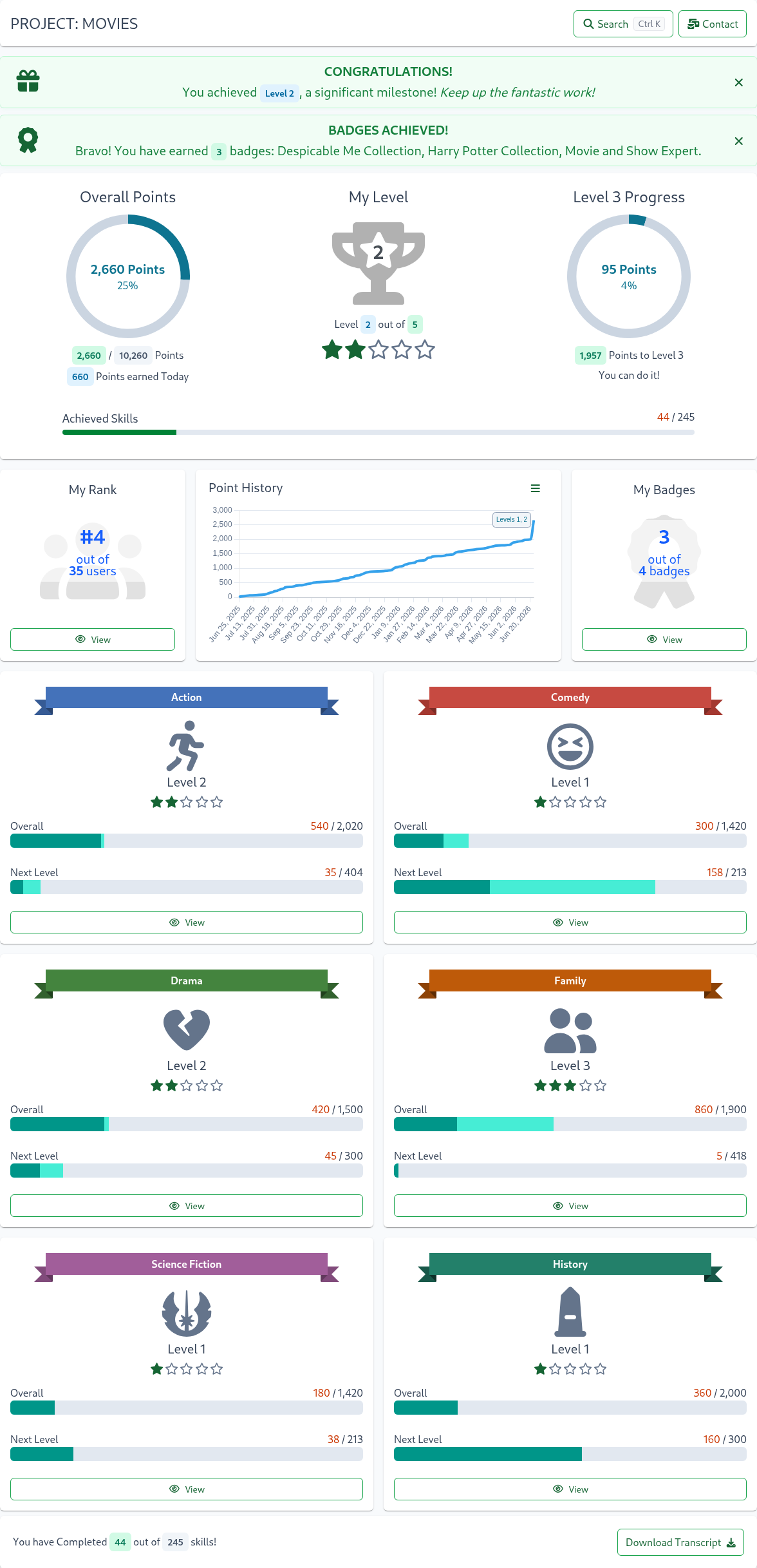
The theme object supports the customization of the color palette of the Skills Display to match your application. For example, you can easily style Skills Display to look something like this:
The theme object supports the following properties:
| Prop | Explanation |
|---|---|
| backgroundColor | page background color |
| disableBreadcrumb | when set to true, the breadcrumb bar in the title section will not be displayed. default is false |
| breadcrumb.linkColor | breadcrumbs's parent/ancestor link color |
| breadcrumb.linkHoverColor | breadcrumbs's parent/ancestor link hover color |
| breadcrumb.currentPageColor | breadcrumbs's current page color |
| breadcrumb.align | breadcrumbs's alignment for the title card; valid values are start, center, end (uses css justify-content) |
| disableSkillTreeBrand | when set to true, the SkillTree brand logo in the title section will not be displayed. default is false |
| skillTreeBrandColor | text color for the SkillTree brand logo; if not supplied the default is pageTitle.textColor |
| maxWidth | maximum width of the component, can use any units supported by max-width CSS property such as %, em and px (ex. 100%); default is 1140px |
| landingPageTitle | title of the landing page, default is User Skills |
| pageTitle.fontSize | font size for the title, can use any units supported by font-size CSS property such as %, em and px (ex. 1.2em) |
| pageTitle.textColor | text color for the title |
| pageTitle.borderColor | border color for the title card |
| pageTitle.borderStyle | border style for the title card, for example: borderStyle: 'none none solid none' |
| pageTitle.backgroundColor | background color for the title card |
| pageTitle.textAlign | title alignment, supported values are left, right and center |
| pageTitle.padding | padding for the title card, for example: padding: '1.6rem 1rem 1.1rem 1rem' |
| pageTitle.margin | margin for the title card, for example: margin: '-10px -15px 1.6rem -15px' |
| circleProgressInteriorTextColor | 'x out of yyyy' text color inside circle progress widgets |
| progressIndicators.beforeTodayColor | progress bar color for points earned before today |
| progressIndicators.earnedTodayColor | progress bar color for points earned today |
| progressIndicators.completeColor | progress bar color for 100% completion |
| progressIndicators.incompleteColor | progress bar color for points not yet earned |
| textSecondaryColor | secondary text, for example 'Need Help?' and dependent skill text |
| textPrimaryColor | chart titles, progress titles, tile titles, descriptions, rank tile text |
| stars.unearnedColor | color of unearned level stars |
| stars.earnedColor | color of earned level stars |
| charts.axisLabelColor | color of scales/axis text on charts |
| charts.labelBackgroundColor | chart label background color; applies to charts like Point History and Level Breakdown; please note that labels visibility depends on the presence of points and achievements |
| charts.labelBorderColor | chart label border color; applies to charts like Point History and Level Breakdown; please note that labels visibility depends on the presence of points and achievements |
| charts.labelForegroundColor | chart label text/foreground color; applies to charts like Point History and Level Breakdown; please note that labels visibility depends on the presence of points and achievements |
| charts.pointHistory.lineColor | Point History chart line color |
| charts.pointHistory.gradientStartColor | Point History chart start gradient color (on the top) |
| charts.pointHistory.gradientStopColor | Point History chart start stop/end color (on the bottom) |
| tiles.backgroundColor | tile background color, such as subject tiles |
| tiles.borderColor | tile border color |
| tiles.watermarkIconColor | My Rank, Rank overview, My Badges watermark icon color |
| tiles.subTitleOverlayBackgroundColor | Background color for the semi-transparent overlay on My Rank and My Badges cards. Use rgba format with alpha parameter, e.g., rgba(243,198,54,0.3). Use with subTitleOverlayTextColor. |
| tiles.subTitleOverlayTextColor | Text color for the overlay on My Rank and My Badges cards. Use with subTitleOverlayBackgroundColor. |
| infoCards.backgroundColor | info card background color; info cards only appear within tiles for example on the skill overview page |
| infoCards.foregroundColor | info card foreground/text color; info cards only appear within tiles for example on the skill overview page |
| infoCards.borderColor | info card border color; info cards only appear within tiles for example on the skill overview page |
| infoCards.iconColors | info card icon colors; must provide a list of colors (up to 4), for example iconColors: ['blue', 'green'] |
| buttons.backgroundColor | button background color |
| buttons.foregroundColor | botton foreground/text color |
| buttons.disabledColor | button disabled color including text and border |
| buttons.borderColor | button border color |
| badges.backgroundColor | badge background color; badges include Self Reportable tag and counts on the skill and badge filters |
| badges.foregroundColor | badge foreground/text color; badges include Self Reportable tag and counts on the skill and badge filters |
| prerequisites.skillColor | Color of the skill icon for the graph's skill nodes, the legend and the table. Found on the prerequisite graph of the Skill page when the Learning Path is configured |
| prerequisites.badgeColor | Color of the badge icon for the graph's badge nodes, the legend and the table. Found on the prerequisite graph of the Skill page when the Learning Path is configured |
| prerequisites.thisSkillColor | Color of the skill icon for the graph's This Skill node. Found on the prerequisite graph of the Skill page when the Learning Path is configured |
| prerequisites.achievedColor | Color of the icon when a prerequisite is achieved for the graph's nodes, the legend and the table. Found on the prerequisite graph of the Skill page when the Learning Path is configured |
| prerequisites.navButtonsColor | Color for graph's navigation buttons (ex. zoom) rendered on the bottom of the graph. Found on the prerequisite graph of the Skill page when the Learning Path is configured |
| subjectTileIconColor | color of subject tile icons |
| trophyIconColor | color of the My Level trophy |
| backButton.padding | optionally customize back button's padding (only applicable if the internalBackButton is enabled via the options object) |
| backButton.fontSize | optionally customize back button's icon size (only applicable if the internalBackButton is enabled via the options object) |
| backButton.lineHeight | optionally customize back button's height (only applicable if the internalBackButton is enabled via the options object) |
Example of a 'Dark Blue' theme object
    {
      maxWidth: '100%',
      backgroundColor: '#626d7d',
      landingPageTitle: 'Themed User Skills',
      pageTitle: {
        textColor: 'white',
        fontSize: '1.5rem',
      },
      textSecondaryColor: 'white',
      textPrimaryColor: 'white',
      stars: {
        unearnedColor: '#787886',
        earnedColor: 'gold',
      },
      progressIndicators: {
        beforeTodayColor: '#3e4d44',
        earnedTodayColor: '#667da4',
        completeColor: '#59ad52',
        incompleteColor: '#cdcdcd',
      },
      charts: {
        axisLabelColor: 'white',
      },
      tiles: {
        backgroundColor:'#152E4d',
        watermarkIconColor: '#a6c5f7',
      },
      buttons: {
        backgroundColor: '#152E4d',
        foregroundColor: '#59ad52',
      },
      prerequisites: {
        achievedColor: '#6df28b',
        skillColor: '#ffe297',
        badgeColor: '#ceb6f4',
        thisSkillColor: '#7fbbfa',
        navButtonsColor: '#cce7f3',
      },
    }
Skills Level Display
The skills-client-ng library also includes a convenient component to display the users's current overall level in the application. This can be used to display the user's current level consistently throughout the application, for example, in the application header.
Reminder
Before using the SkillsLevel component, you must make sure to initialize SkillsConfiguration with your system settings.
First, import the module into your app.module.ts file:
import { SkillsLevelModule } from '@skilltree/skills-client-ng'

@NgModule({
  declarations: [
    ShowSkillsLevelComponent,
  ],
  imports: [SkillsLevelModule],
})
export class YourAppModule {
}
then simply declare the skill-level component where appropriate
import { Component } from '@angular/core';

@Component({
  selector: 'app-root',
  template: `
    <div class="container">
        <skills-level/>
    </div>
  `,
})
export class ShowSkillsLevelComponent {
  constructor() { }
}
Skill Event Reporting
The skills-client-ng library is packaged with the ability to report skill events using either Angular directives or the JS utility.
skilltree directive
Import the directive in your app.module.ts file:
import { SkilltreeModule } from '@skilltree/skills-client-ng'

@NgModule({
  imports: [SkilltreeModule],
})
export class YourAppModule {
}
Now you can use the skill-tree directive to report skill events, the following example will report an event for a skill with id 'IronMan' when the button is clicked:
<button [skilltree]="'IronMan'">Report Skill</button>
The skilltree directive supports both <button> and <input> HTML node types. For a <button> element, the click event will trigger the skill event reporting and on <input> elements the input event will trigger the skill event reporting for the passed in skillId. Here is an example of an input event:
<input type="text" [skilltree]="\'Thor\'"><input/>
The Skills service add-skill-event endpoint responds with a comprehensive metatdata object describing how that skill influenced the user's skills posture. The skilltree directive provides a way to capture that result via a callback method, for example:
<input type="text"
    [skilltree]="'Thor'"
    (skills-report-success)="onReporterResponse"/>
and then let's say:
onReporterResponse(response) {
   // do what you need with response object
},
a response object may look something like this:
{
  "success": true,
  "skillApplied": true,
  "explanation": "Skill event was applied",
  "completed": []
}
For a full description of the response object please see Endpoint Result Object.
There are times when the HTTP call could fail, such as access denied or internal server error. You can also listen on the skills-report-error event to handle these situations.
<input type="text"
    [skilltree]="'Thor'"
    (skills-report-success)="onReporterResponse"
    (skills-report-error)="onReporterError" />
SkillsReporter JS utility
If you find that the skilltree directive is not meeting your needs then there is always the JS utility to report skills:
import { SkillsReporter } from '@skilltree/skills-client-ng';

SkillsReporter.reportSkill(skillId)
    .then((res) => {
        // res = metatdata describing how that skill influenced user's skills posture
    })
    .catch((err) => {
        // err = object describing why this error occrued
    });
Global Event Handling
In many cases, it is useful to define a global success and/or error handler function rather than defining event listeners on each element where you include the reporting utility.
For example:
- display messages congratulating users on skills completion as well as level and badge achievements
- handle all reporting errors by sending them to a logging service
Alongside standard, promise based, success and error handling, the SkillsReporter native javascript utility allows you to configure global success and error handlers utilizing the addSuccessHandler and addErrorHandler methods.
const myGlobalSuccessHandler = (result) => {
    toastr.success('skill successfully recorded!');
};

const myGlobalErrorHandler = (result) => {
    toastr.error('There was an error recording your skill');
};

SkillsConfiguration.afterConfigure().then(() => {
    SkillsReporter.addSuccessHandler(myGlobalSuccessHandler);
    SkillsReporter.addErrorHandler(myGlobalErrorHandler);
});
To avoid race conditions, please ensure that the configuration is loaded by adding global handlers within the SkillsConfiguration.afterConfigure() callback.
Note: By default, a global success handler will only by invoked for results where a skill has been applied (skillApplied=true). To change the default behavior and enable notifications even when a reported skill has not been applied, set the notifyIfSkillNotApplied configuration option on the SkillReporter utility:
SkillsReporter.configure({
    notifyIfSkillNotApplied: true,
});
For a full description of the success response object (named result in the above example) please see Endpoint Result Object.
Here is a full example that registers and handles an event by displaying a toast message:
export class ToastExampleComponent
    registerToDisplayProgress() {
        const myGlobalSuccessHandler = (result) => {
          if (result.completed) {
            result.completed.forEach((completedItem) => {
              this.handleEvent(completedItem);
            });
          }
        };
        SkillsReporter.addSuccessHandler(myGlobalSuccessHandler);
    }

    handleEvent(completedItem) {
        let title = '';
        let msg = '';
        switch (completedItem.type) {
        case 'Overall':
          title = `Level ${completedItem.level}!!!!`;
          msg = `Wow! Congratulations on the Overall Level ${completedItem.level}!`;
          break;
        case 'Subject':
          title = 'Subject Level Achieved!!';
          msg = `Impressive!! Level ${completedItem.level} in ${completedItem.name} subject!`;
          break;
        case 'Skill':
          title = 'Skill Completed!!';
          msg = `Way to complete ${completedItem.name} skill!!!`;
          break;
        case 'Badge':
          title = `${completedItem.name}!!!`;
          msg = `You are now a proud owner of ${completedItem.name} badge!!!`;
          break;
        default:
          title = 'Completed!!';
          msg = `Way to finish ${completedItem.name}!`;
        }

        this.displayToast(msg, title);
    }
}
Please note that the displayToast implementation is omitted as that will be specific to your application.
SkillsReporter Configuration
The SkillReporter object allows for overriding the default behavior if required via the configure() method.
The configure() method supports the following parameters:
| Prop | Explanation |
|---|---|
| notifyIfSkillNotApplied | if set to true, invoke global success handler(s) even when a reported skill has not been applied. See Global Event Handling. |
| retryInterval | If an error occurs when reporting a skill, the SkillsReporter will attempt to retry reporting the skill at a later time. This property allows you to set the time in milliseconds for how often a skill that failed to be reported will be retried. default is 60000 (every 60 seconds) |
| maxRetryQueueSize | The maximum number of failed reported skill attempts that will be queued and retried. default is 1000 |
| maxRetryAttempts | The maximum number of retry attempts for a given skillId before the SkillsReporter will no longer retry to report that skillId. default is 1400 |
Below is an example of how to configure the SkillsReporter to only retry up to 100 failed reported skill attempts, and to retry every 5 minutes.
SkillsReporter.configure({
    retryInterval: 300000,
    maxRetryQueueSize: 100,
});
Report Event By Listening to Routes
While the skilltree client library doesn't provide an automatic way to report skills based on route changes it is quite easy to implement if you are using Angular Router. Here is an example using Vue Router Router Events:
import { Router, NavigationEnd  } from '@angular/router';
constructor(private router:Router) {
  this.routeEvent(this.router);
}
routeEvent(router: Router){
  router.events.subscribe(e => {
    if(e instanceof NavigationEnd) {
      const reportSkillId = router.routerState.snapshot.root.params['reportSkillId']
      if (reportSkillId) {
        SkillsConfiguration.afterConfigure()
          .then(() => {
            SkillsReporter.reportSkill(reportSkillId);
          });
      }
    }
  });
}
React Integration
To install client libraries:
npm install @skilltree/skills-client-react --save
This JS library contains:
- Skills Configuration - Global configuration used by Skills utilities.
- Skills Display - Visualize your website users' skill profile
- Skill Event Reporting - Report skill events using JS utility
Skills Configuration
Reminder
Before using the SkillsDisplay, you must make sure to initialize SkillsConfiguration with your system settings.
Step one is to globally configure the Skills client, we suggest including it in the application's entry point for single page applications, or as the first script tag import in multi-page applications.
Reminder
SkillsConfiguration is a singleton and you only need to provide configuration information once per your application's runtime for single page applications.
Stop
SkillsConfiguration.logout() must be called when a user logs out of your application. SkillsConfiguration caches the authenticator end point which is more than likely specific to the currently logged in user.
import { SkillsConfiguration } from '@skilltree/skills-client-react';

SkillsConfiguration.configure({
  serviceUrl: 'http://localhost:8080',
  projectId: 'your-project-id',
  authenticator: 'http://<your-app-host>/api/users/user1/token',
});

 . . . .

// User logs out
logoutButton.onClick(() => {
    // VERY IMPORTANT
    SkillsConfiguration.logout();
});
This configuration is used by the Skills Display and Skills Reporting libraries so you won't need to configure those separately.
SkillsConfiguration configure parameters:
| Parameter | Type | Explanation |
|---|---|---|
| serviceUrl | String (representing URL) | url to the skills service - this is the same url as the dashboard - the User Interface and service endpoints are co-located |
| projectId | String | the id of the project that was created in the dashboard; visualize and report skills for the project with this id |
| authenticator | String | url to your Authentication Endpoint |
| enabled | Boolean | (optional, default is true) When set to false, when disabled, the skills-client library goes into a dormant state and does not attempt authentication, network communication, skill reporting, or any other activities. |
| SkillsConfiguration supplies the afterConfigure() method which returns a promise which will be resolved once the SkillsConfiguration configure method | ||
| completes. This allows support, for example, for configuration options to be supplied by the server asynchronously. |
import { SkillsConfiguration } from '@skilltree/skills-client-react';

SkillsConfiguration.afterConfigure()
  .then(() => {
    // SkillsConfiguration.configure has been called
  });

axios.get('my/configuration/endpoint')
  .then((result) => {
     SkillsConfiguration.configure(result.data);
   });
e
Skills Display
The Skills Display component provides a comprehensive visualization of a user's skill and progress profile!
The previously installed skills-client-react library is packaged with the Skills Display component.
Usage is trivial:
- Import the SkillsDisplay component:
import { SkillsDisplay } from '@skilltree/skills-client-react'; - Utilize the SkillsDisplay component:
<SkillsDisplay/>
Here is a full example of a React component that uses SkillsDisplay:
import { SkillsDisplay } from '@skilltree/skills-client-react';

const MyComponent = (props) => {
    return (
        <div className="myComp">
            <SkillsDisplay />
        </div>
    );
};

export default MyComponent;
If you are taking advantage of Skills Versioning then you need to provide the version property to the SkillsDisplay component:
<SkillsDisplay version="1"/>
SkillsDisplay component properties:
| Prop | Type | Explanation |
|---|---|---|
| version | Number | (Optional) version to use in Skills Versioning paradigm |
| options | Object | (Optional) options object to control various behaviors of skills-display. See Skills Display Options Object |
| theme | Object | (Optional) theme object to customize colors. See Skills Display Theme Object |
Route changed event 🕓 Since version 3.3.0
Each time a user navigates within the Skills Client Display, if configured, the handleRouteChanged callback function will be invoked and passed the new path that was navigated to. This can be useful if the hosting application displays a breadcrumb and would like to update the current location within the Skills Client Display component.
const handleRouteChanged = (newPath) => {
    console.log(`New Skills Display path: [${newPath}]`);
};

<SkillsDisplay handleRouteChanged={handleRouteChanged}/>
Programmatic navigation 🕓 Since version 3.3.1
The internal route of the Skills Client Display component can be changed by passing the desired path to the navigate() method. This can be useful if the hosting application displays a breadcrumb and would like to navigate to different locations within the Skills Client Display component by clicking a breadcrumb link for example.
  const skillsDisplayRef = React.createRef()
  const navigate = () => {
      skillsDisplayRef.current.navigate('/subjects/subj0');
  };

  <SkillsDisplay ref={skillsDisplayRef}/>
Skills Display Options Object
Options object optionally controls various behaviors of skills display with the following properties:
| Prop | Type | Default | Explanation |
|---|---|---|---|
| disableAutoScroll | boolean | false | As a convenience, by default, the Skills Client Display will auto scroll to the top whenever the user navigates to a new page (route) within the display. Disable auto scroll to top on route change. |
| autoScrollStrategy | string | 'top-of-frame' | On route change, either scroll to the top of the entire document, or the top of skills-display ('top-of-page','top-of-frame', or 'top-offset' - 'top offset' must be used in conjunction with the 'scrollTopOffset' option) |
| scrollTopOffset | number | 0 | Used in conjunction with the autoScrollStrategy 'top-offset', scrollTopOffset will be subtracted from the display's element offset as the scroll to target (relevant when fixed/statically positioned elements preceed the Skills Display container). |
| isSummaryOnly | boolean | false | When enabled, display renders overall summary only. This mode is not interactive, it provides a user's progress preview that can be displayed on a landing page. |
| internalBackButton | boolean | false | When enabled, a back button is displayed to the left of the page title, allowing users to navigate back in the browser history within the Skills Client Display. Generally, it is not required to enable this button, as Skills Display updates the URL and utilizes browser history for navigating back. |
| updateHistory | boolean | true | When updateHistory is disabled, the native browser history will not be updated when navigating within the Skills Client Display. It is generally recommended to leave this property enabled unless navigating within the Skills Client Display interferes with the hosting application. If disabled, it is recommended to also enable internalBackButton to allow users to navigate back. |
Here is an example of an options object:
{
    disableAutoScroll: false,
    autoScrollStrategy: 'top-of-page',
}
Skills Display Theme Object
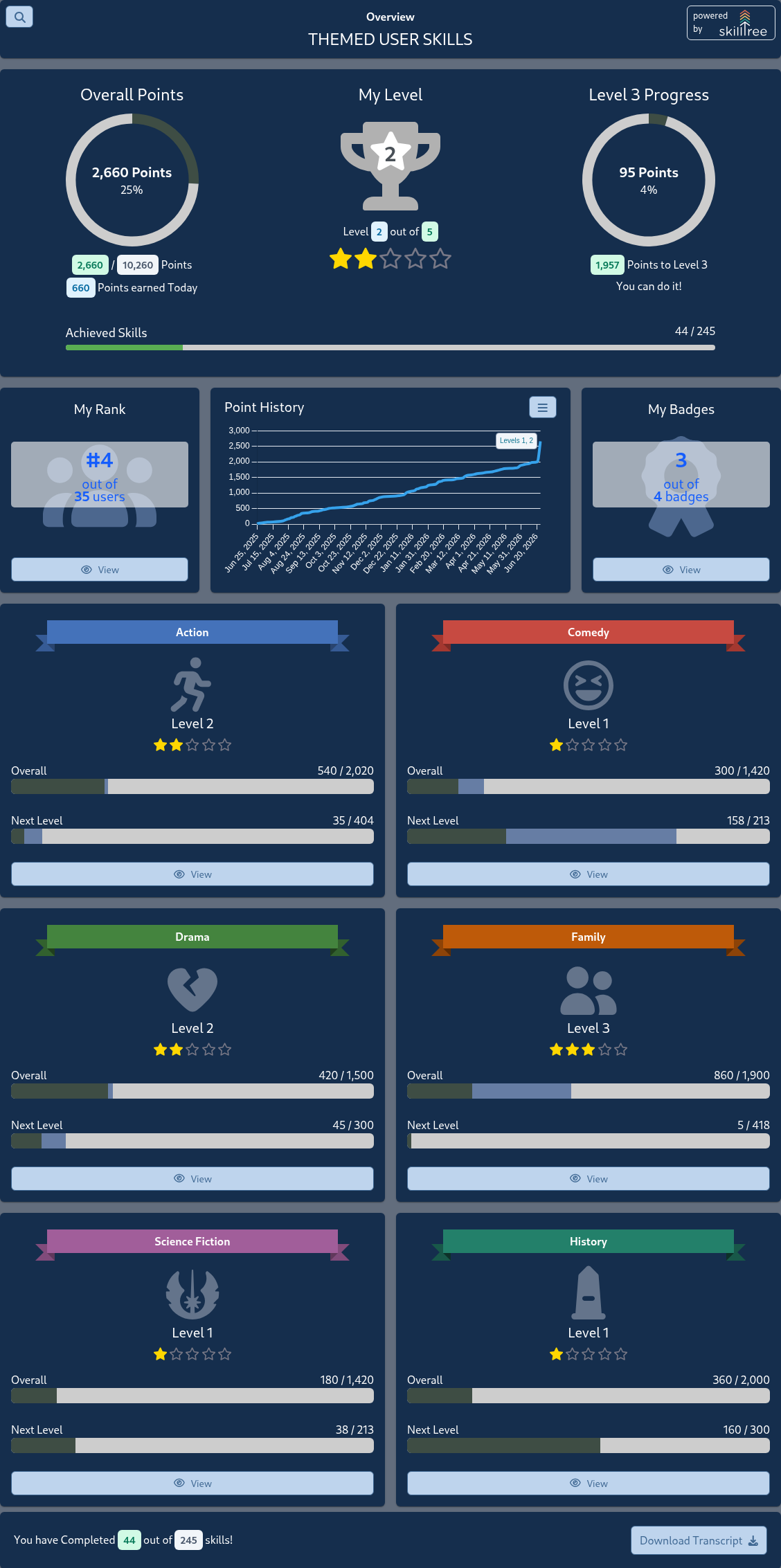
The theme object supports the customization of the color palette of the Skills Display to match your application. For example, you can easily style Skills Display to look something like this:
The theme object supports the following properties:
| Prop | Explanation |
|---|---|
| backgroundColor | page background color |
| disableBreadcrumb | when set to true, the breadcrumb bar in the title section will not be displayed. default is false |
| breadcrumb.linkColor | breadcrumbs's parent/ancestor link color |
| breadcrumb.linkHoverColor | breadcrumbs's parent/ancestor link hover color |
| breadcrumb.currentPageColor | breadcrumbs's current page color |
| breadcrumb.align | breadcrumbs's alignment for the title card; valid values are start, center, end (uses css justify-content) |
| disableSkillTreeBrand | when set to true, the SkillTree brand logo in the title section will not be displayed. default is false |
| skillTreeBrandColor | text color for the SkillTree brand logo; if not supplied the default is pageTitle.textColor |
| maxWidth | maximum width of the component, can use any units supported by max-width CSS property such as %, em and px (ex. 100%); default is 1140px |
| landingPageTitle | title of the landing page, default is User Skills |
| pageTitle.fontSize | font size for the title, can use any units supported by font-size CSS property such as %, em and px (ex. 1.2em) |
| pageTitle.textColor | text color for the title |
| pageTitle.borderColor | border color for the title card |
| pageTitle.borderStyle | border style for the title card, for example: borderStyle: 'none none solid none' |
| pageTitle.backgroundColor | background color for the title card |
| pageTitle.textAlign | title alignment, supported values are left, right and center |
| pageTitle.padding | padding for the title card, for example: padding: '1.6rem 1rem 1.1rem 1rem' |
| pageTitle.margin | margin for the title card, for example: margin: '-10px -15px 1.6rem -15px' |
| circleProgressInteriorTextColor | 'x out of yyyy' text color inside circle progress widgets |
| progressIndicators.beforeTodayColor | progress bar color for points earned before today |
| progressIndicators.earnedTodayColor | progress bar color for points earned today |
| progressIndicators.completeColor | progress bar color for 100% completion |
| progressIndicators.incompleteColor | progress bar color for points not yet earned |
| textSecondaryColor | secondary text, for example 'Need Help?' and dependent skill text |
| textPrimaryColor | chart titles, progress titles, tile titles, descriptions, rank tile text |
| stars.unearnedColor | color of unearned level stars |
| stars.earnedColor | color of earned level stars |
| charts.axisLabelColor | color of scales/axis text on charts |
| charts.labelBackgroundColor | chart label background color; applies to charts like Point History and Level Breakdown; please note that labels visibility depends on the presence of points and achievements |
| charts.labelBorderColor | chart label border color; applies to charts like Point History and Level Breakdown; please note that labels visibility depends on the presence of points and achievements |
| charts.labelForegroundColor | chart label text/foreground color; applies to charts like Point History and Level Breakdown; please note that labels visibility depends on the presence of points and achievements |
| charts.pointHistory.lineColor | Point History chart line color |
| charts.pointHistory.gradientStartColor | Point History chart start gradient color (on the top) |
| charts.pointHistory.gradientStopColor | Point History chart start stop/end color (on the bottom) |
| tiles.backgroundColor | tile background color, such as subject tiles |
| tiles.borderColor | tile border color |
| tiles.watermarkIconColor | My Rank, Rank overview, My Badges watermark icon color |
| tiles.subTitleOverlayBackgroundColor | Background color for the semi-transparent overlay on My Rank and My Badges cards. Use rgba format with alpha parameter, e.g., rgba(243,198,54,0.3). Use with subTitleOverlayTextColor. |
| tiles.subTitleOverlayTextColor | Text color for the overlay on My Rank and My Badges cards. Use with subTitleOverlayBackgroundColor. |
| infoCards.backgroundColor | info card background color; info cards only appear within tiles for example on the skill overview page |
| infoCards.foregroundColor | info card foreground/text color; info cards only appear within tiles for example on the skill overview page |
| infoCards.borderColor | info card border color; info cards only appear within tiles for example on the skill overview page |
| infoCards.iconColors | info card icon colors; must provide a list of colors (up to 4), for example iconColors: ['blue', 'green'] |
| buttons.backgroundColor | button background color |
| buttons.foregroundColor | botton foreground/text color |
| buttons.disabledColor | button disabled color including text and border |
| buttons.borderColor | button border color |
| badges.backgroundColor | badge background color; badges include Self Reportable tag and counts on the skill and badge filters |
| badges.foregroundColor | badge foreground/text color; badges include Self Reportable tag and counts on the skill and badge filters |
| prerequisites.skillColor | Color of the skill icon for the graph's skill nodes, the legend and the table. Found on the prerequisite graph of the Skill page when the Learning Path is configured |
| prerequisites.badgeColor | Color of the badge icon for the graph's badge nodes, the legend and the table. Found on the prerequisite graph of the Skill page when the Learning Path is configured |
| prerequisites.thisSkillColor | Color of the skill icon for the graph's This Skill node. Found on the prerequisite graph of the Skill page when the Learning Path is configured |
| prerequisites.achievedColor | Color of the icon when a prerequisite is achieved for the graph's nodes, the legend and the table. Found on the prerequisite graph of the Skill page when the Learning Path is configured |
| prerequisites.navButtonsColor | Color for graph's navigation buttons (ex. zoom) rendered on the bottom of the graph. Found on the prerequisite graph of the Skill page when the Learning Path is configured |
| subjectTileIconColor | color of subject tile icons |
| trophyIconColor | color of the My Level trophy |
| backButton.padding | optionally customize back button's padding (only applicable if the internalBackButton is enabled via the options object) |
| backButton.fontSize | optionally customize back button's icon size (only applicable if the internalBackButton is enabled via the options object) |
| backButton.lineHeight | optionally customize back button's height (only applicable if the internalBackButton is enabled via the options object) |
Example of a 'Dark Blue' theme object
    {
      maxWidth: '100%',
      backgroundColor: '#626d7d',
      landingPageTitle: 'Themed User Skills',
      pageTitle: {
        textColor: 'white',
        fontSize: '1.5rem',
      },
      textSecondaryColor: 'white',
      textPrimaryColor: 'white',
      stars: {
        unearnedColor: '#787886',
        earnedColor: 'gold',
      },
      progressIndicators: {
        beforeTodayColor: '#3e4d44',
        earnedTodayColor: '#667da4',
        completeColor: '#59ad52',
        incompleteColor: '#cdcdcd',
      },
      charts: {
        axisLabelColor: 'white',
      },
      tiles: {
        backgroundColor:'#152E4d',
        watermarkIconColor: '#a6c5f7',
      },
      buttons: {
        backgroundColor: '#152E4d',
        foregroundColor: '#59ad52',
      },
      prerequisites: {
        achievedColor: '#6df28b',
        skillColor: '#ffe297',
        badgeColor: '#ceb6f4',
        thisSkillColor: '#7fbbfa',
        navButtonsColor: '#cce7f3',
      },
    }
Skills Level Display
The skills-client-react library also includes a convenient component to display the users's current overall level in the application. This can be used to display the user's current level consistently throughout the application, for example, in the application header.
Reminder
Before using the SkillsLevel component, you must make sure to initialize SkillsConfiguration with your system settings.
import { SkillsLevel } from '@skilltree/skills-client-react';
import Button from "react-bootstrap/Button"

const MyLevelDisplay = (props) => {
    return (
      <Button variant="primary">
          <SkillsLevel projectId={props.projectId}/>
      </Button>
    );
};

export default MyLevelDisplay;
Skills Event Reporting
The skills-client-react library also includes the SkillsReporter utility used to report skills events.
SkillsReporter JS Utility
Reminder
Before using the SkillsReporter utility, you must make sure to initialize SkillsConfiguration with your system settings. See the SkillsConfiguration Documentation
Import the SkillsReporter into your project and integrate it into actions within your UI.
import { SkillsReporter } from '@skilltree/skills-client-react';

const MyComponent = () => {
    const reportSkill = (skillId) => {
        SkillsReporter.reportSkill(skillId)
            .then((response) => {
                //do something with the response
            });
    };

    return (
        <div className="myApp">
            <button onClick={() => reportSkill('buttonClickedSkill')}>Click Me!</button>
        </div>
    );
};

export default MyComponent;
SkillsReporter.reportSkill returns a metadata response object describing how that skill action influenced the user's skills posture. A response object may look something like this:
{
  "success": true,
  "skillApplied": true,
  "explanation": "Skill event was applied",
  "completed": []
}
For a full description of the response object please see Endpoint Result Object.
Global Event Handling
In many cases, it is useful to define a global success and/or error handler function rather than defining event listeners on each element where you include the reporting utility.
For example:
- display messages congratulating users on skills completion as well as level and badge achievements
- handle all reporting errors by sending them to a logging service
Alongside standard, promise based, success and error handling, the SkillsReporter native javascript utility allows you to configure global success and error handlers utilizing the addSuccessHandler and addErrorHandler methods.
const myGlobalSuccessHandler = (result) => {
    toastr.success('skill successfully recorded!');
};

const myGlobalErrorHandler = (result) => {
    toastr.error('There was an error recording your skill');
};

SkillsConfiguration.afterConfigure().then(() => {
    SkillsReporter.addSuccessHandler(myGlobalSuccessHandler);
    SkillsReporter.addErrorHandler(myGlobalErrorHandler);
});
To avoid race conditions, please ensure that the configuration is loaded by adding global handlers within the SkillsConfiguration.afterConfigure() callback.
Note: By default, a global success handler will only by invoked for results where a skill has been applied (skillApplied=true). To change the default behavior and enable notifications even when a reported skill has not been applied, set the notifyIfSkillNotApplied configuration option on the SkillReporter utility:
SkillsReporter.configure({
    notifyIfSkillNotApplied: true,
});
For a full description of the success response object (named result in the above example) please see Endpoint Result Object.
SkillsReporter Configuration
The SkillReporter object allows for overriding the default behavior if required via the configure() method.
The configure() method supports the following parameters:
| Prop | Explanation |
|---|---|
| notifyIfSkillNotApplied | if set to true, invoke global success handler(s) even when a reported skill has not been applied. See Global Event Handling. |
| retryInterval | If an error occurs when reporting a skill, the SkillsReporter will attempt to retry reporting the skill at a later time. This property allows you to set the time in milliseconds for how often a skill that failed to be reported will be retried. default is 60000 (every 60 seconds) |
| maxRetryQueueSize | The maximum number of failed reported skill attempts that will be queued and retried. default is 1000 |
| maxRetryAttempts | The maximum number of retry attempts for a given skillId before the SkillsReporter will no longer retry to report that skillId. default is 1400 |
Below is an example of how to configure the SkillsReporter to only retry up to 100 failed reported skill attempts, and to retry every 5 minutes.
SkillsReporter.configure({
    retryInterval: 300000,
    maxRetryQueueSize: 100,
});
Vue.js Integration
To install client libraries:
npm install @skilltree/skills-client-vue --save
This JS library contains:
- Skills Configuration - Global configuration used by Skills utilities.
- Skills Display - Visualize your website users' skill profile
- Skill Event Reporting - Report skill events using JS utility
Skills Configuration
Step one is to globally configure the Skills client, we suggest including it in the application's entry point for single page applications, or as the first script tag import in multi-page applications.
Reminder
SkillsConfiguration is a singleton and you only need to provide configuration information once per your application's runtime for single page applications.
Stop
SkillsConfiguration.logout() must be called when a user logs out of your application. SkillsConfiguration caches the authenticator end point which is more than likely specific to the currently logged in user.
import { SkillsConfiguration } from '@skilltree/skills-client-vue';

SkillsConfiguration.configure({
  serviceUrl: 'http://localhost:8080',
  projectId: 'your-project-id',
  authenticator: 'http://<your-app-host>/api/users/user1/token',
});

 . . . .

// User logs out
logoutButton.onClick(() => {
    // VERY IMPORTANT
    SkillsConfiguration.logout();
});
This configuration is used by the Skills Display and Skills Reporting libraries so you won't need to configure those separately.
SkillsConfiguration configure parameters:
| Parameter | Type | Explanation |
|---|---|---|
| serviceUrl | String (representing URL) | url to the skills service - this is the same url as the dashboard - the User Interface and service endpoints are co-located |
| projectId | String | the id of the project that was created in the dashboard; visualize and report skills for the project with this id |
| authenticator | String | url to your Authentication Endpoint |
| enabled | Boolean | (optional, default is true) When set to false, when disabled, the skills-client library goes into a dormant state and does not attempt authentication, network communication, skill reporting, or any other activities. |
| SkillsConfiguration supplies the afterConfigure() method which returns a promise which will be resolved once the SkillsConfiguration configure method | ||
| completes. This allows support, for example, for configuration options to be supplied by the server asynchronously. |
import { SkillsConfiguration } from '@skilltree/skills-client-vue';

SkillsConfiguration.afterConfigure()
  .then(() => {
    // SkillsConfiguration.configure has been called
  });

axios.get('my/configuration/endpoint')
  .then((result) => {
     SkillsConfiguration.configure(result.data);
   });
Skills Display
The Skills Display component provides a comprehensive visualization of a user's skill and progress profile!
The previously installed skills-client-vue library is packaged with the Skills Display component.
Usage is trivial:
- Import SkillsDisplay component:
import { SkillsDisplay } from '@skilltree/skills-client-vue'; - Utilize SkillsDisplay component:
<skills-display/>
Here is a full example of a Vue.js single-file component that uses SkillsDisplay:
<template>
    <div class="container">
        <skills-display/>
    </div>
</template>

<script>
    import { SkillsDisplay } from '@skilltree/skills-client-vue';
    export default {
        name: "ShowSkills",
        components: {SkillsDisplay},
    }
</script>
If you are taking advantage of Skills Versioning then you need to provide the version property to the SkillsDisplay component:
<skills-display :version="currentVersion"/>
SkillsDisplay component properties:
| Prop | Type | Explanation |
|---|---|---|
| version | Number | (Optional) version to use in Skills Versioning paradigm |
| options | Object | (Optional) options object to control various behaviors of skills-display. See Skills Display Options Object |
| theme | Object | (Optional) theme object to customize colors. See Skills Display Theme Object |
Route changed event 🕓 Since version 3.3.0
Each time a user navigates within the Skills Client Display, the route-changed event is emitted containing the new path that was navigated to. This can be useful if the hosting application displays a breadcrumb and would like to update the current location within the Skills Client Display component.
<template>
    <div class="container">
        <skills-display @route-changed="skillsDisplayRouteChanged"/>
    </div>
</template>

...
<script>
    import { SkillsDisplay } from '@skilltree/skills-client-vue';
    export default {
        name: "ShowSkills",
        components: {SkillsDisplay},
        methods: {
          skillsDisplayRouteChanged(newPath) {
            console.log(`New Skills Display path: [${newPath}]`);
          },
        },
    }
</script>
Programmatic navigation 🕓 Since version 3.3.1
The internal route of the Skills Client Display component can be changed by passing the desired path to the navigate() method. This can be useful if the hosting application displays a breadcrumb and would like to navigate to different locations within the Skills Client Display component by clicking a breadcrumb link for example.
<template>
    <div class="container">
        <b-button @click="navigate">Navigate</b-button>
        <skills-display ref="skillsDisplayRef"/>
    </div>
</template>

...
<script>
    import { SkillsDisplay } from '@skilltree/skills-client-vue';
    export default {
        name: "ShowSkills",
        components: {SkillsDisplay},
        methods: {
          navigate() {
            this.$refs.skillsDisplayRef.navigate('/subjects/subj0');
          },
        },
    }
</script>
Skills Display Options Object
Options object optionally controls various behaviors of skills display with the following properties:
| Prop | Type | Default | Explanation |
|---|---|---|---|
| disableAutoScroll | boolean | false | As a convenience, by default, the Skills Client Display will auto scroll to the top whenever the user navigates to a new page (route) within the display. Disable auto scroll to top on route change. |
| autoScrollStrategy | string | 'top-of-frame' | On route change, either scroll to the top of the entire document, or the top of skills-display ('top-of-page','top-of-frame', or 'top-offset' - 'top offset' must be used in conjunction with the 'scrollTopOffset' option) |
| scrollTopOffset | number | 0 | Used in conjunction with the autoScrollStrategy 'top-offset', scrollTopOffset will be subtracted from the display's element offset as the scroll to target (relevant when fixed/statically positioned elements preceed the Skills Display container). |
| isSummaryOnly | boolean | false | When enabled, display renders overall summary only. This mode is not interactive, it provides a user's progress preview that can be displayed on a landing page. |
| internalBackButton | boolean | false | When enabled, a back button is displayed to the left of the page title, allowing users to navigate back in the browser history within the Skills Client Display. Generally, it is not required to enable this button, as Skills Display updates the URL and utilizes browser history for navigating back. |
| updateHistory | boolean | true | When updateHistory is disabled, the native browser history will not be updated when navigating within the Skills Client Display. It is generally recommended to leave this property enabled unless navigating within the Skills Client Display interferes with the hosting application. If disabled, it is recommended to also enable internalBackButton to allow users to navigate back. |
Here is an example of an options object:
{
    disableAutoScroll: false,
    autoScrollStrategy: 'top-of-page',
}
Skills Display Theme Object
The theme object supports the customization of the color palette of the Skills Display to match your application. For example, you can easily style Skills Display to look something like this:
The theme object supports the following properties:
| Prop | Explanation |
|---|---|
| backgroundColor | page background color |
| disableBreadcrumb | when set to true, the breadcrumb bar in the title section will not be displayed. default is false |
| breadcrumb.linkColor | breadcrumbs's parent/ancestor link color |
| breadcrumb.linkHoverColor | breadcrumbs's parent/ancestor link hover color |
| breadcrumb.currentPageColor | breadcrumbs's current page color |
| breadcrumb.align | breadcrumbs's alignment for the title card; valid values are start, center, end (uses css justify-content) |
| disableSkillTreeBrand | when set to true, the SkillTree brand logo in the title section will not be displayed. default is false |
| skillTreeBrandColor | text color for the SkillTree brand logo; if not supplied the default is pageTitle.textColor |
| maxWidth | maximum width of the component, can use any units supported by max-width CSS property such as %, em and px (ex. 100%); default is 1140px |
| landingPageTitle | title of the landing page, default is User Skills |
| pageTitle.fontSize | font size for the title, can use any units supported by font-size CSS property such as %, em and px (ex. 1.2em) |
| pageTitle.textColor | text color for the title |
| pageTitle.borderColor | border color for the title card |
| pageTitle.borderStyle | border style for the title card, for example: borderStyle: 'none none solid none' |
| pageTitle.backgroundColor | background color for the title card |
| pageTitle.textAlign | title alignment, supported values are left, right and center |
| pageTitle.padding | padding for the title card, for example: padding: '1.6rem 1rem 1.1rem 1rem' |
| pageTitle.margin | margin for the title card, for example: margin: '-10px -15px 1.6rem -15px' |
| circleProgressInteriorTextColor | 'x out of yyyy' text color inside circle progress widgets |
| progressIndicators.beforeTodayColor | progress bar color for points earned before today |
| progressIndicators.earnedTodayColor | progress bar color for points earned today |
| progressIndicators.completeColor | progress bar color for 100% completion |
| progressIndicators.incompleteColor | progress bar color for points not yet earned |
| textSecondaryColor | secondary text, for example 'Need Help?' and dependent skill text |
| textPrimaryColor | chart titles, progress titles, tile titles, descriptions, rank tile text |
| stars.unearnedColor | color of unearned level stars |
| stars.earnedColor | color of earned level stars |
| charts.axisLabelColor | color of scales/axis text on charts |
| charts.labelBackgroundColor | chart label background color; applies to charts like Point History and Level Breakdown; please note that labels visibility depends on the presence of points and achievements |
| charts.labelBorderColor | chart label border color; applies to charts like Point History and Level Breakdown; please note that labels visibility depends on the presence of points and achievements |
| charts.labelForegroundColor | chart label text/foreground color; applies to charts like Point History and Level Breakdown; please note that labels visibility depends on the presence of points and achievements |
| charts.pointHistory.lineColor | Point History chart line color |
| charts.pointHistory.gradientStartColor | Point History chart start gradient color (on the top) |
| charts.pointHistory.gradientStopColor | Point History chart start stop/end color (on the bottom) |
| tiles.backgroundColor | tile background color, such as subject tiles |
| tiles.borderColor | tile border color |
| tiles.watermarkIconColor | My Rank, Rank overview, My Badges watermark icon color |
| tiles.subTitleOverlayBackgroundColor | Background color for the semi-transparent overlay on My Rank and My Badges cards. Use rgba format with alpha parameter, e.g., rgba(243,198,54,0.3). Use with subTitleOverlayTextColor. |
| tiles.subTitleOverlayTextColor | Text color for the overlay on My Rank and My Badges cards. Use with subTitleOverlayBackgroundColor. |
| infoCards.backgroundColor | info card background color; info cards only appear within tiles for example on the skill overview page |
| infoCards.foregroundColor | info card foreground/text color; info cards only appear within tiles for example on the skill overview page |
| infoCards.borderColor | info card border color; info cards only appear within tiles for example on the skill overview page |
| infoCards.iconColors | info card icon colors; must provide a list of colors (up to 4), for example iconColors: ['blue', 'green'] |
| buttons.backgroundColor | button background color |
| buttons.foregroundColor | botton foreground/text color |
| buttons.disabledColor | button disabled color including text and border |
| buttons.borderColor | button border color |
| badges.backgroundColor | badge background color; badges include Self Reportable tag and counts on the skill and badge filters |
| badges.foregroundColor | badge foreground/text color; badges include Self Reportable tag and counts on the skill and badge filters |
| prerequisites.skillColor | Color of the skill icon for the graph's skill nodes, the legend and the table. Found on the prerequisite graph of the Skill page when the Learning Path is configured |
| prerequisites.badgeColor | Color of the badge icon for the graph's badge nodes, the legend and the table. Found on the prerequisite graph of the Skill page when the Learning Path is configured |
| prerequisites.thisSkillColor | Color of the skill icon for the graph's This Skill node. Found on the prerequisite graph of the Skill page when the Learning Path is configured |
| prerequisites.achievedColor | Color of the icon when a prerequisite is achieved for the graph's nodes, the legend and the table. Found on the prerequisite graph of the Skill page when the Learning Path is configured |
| prerequisites.navButtonsColor | Color for graph's navigation buttons (ex. zoom) rendered on the bottom of the graph. Found on the prerequisite graph of the Skill page when the Learning Path is configured |
| subjectTileIconColor | color of subject tile icons |
| trophyIconColor | color of the My Level trophy |
| backButton.padding | optionally customize back button's padding (only applicable if the internalBackButton is enabled via the options object) |
| backButton.fontSize | optionally customize back button's icon size (only applicable if the internalBackButton is enabled via the options object) |
| backButton.lineHeight | optionally customize back button's height (only applicable if the internalBackButton is enabled via the options object) |
Example of a 'Dark Blue' theme object
    {
      maxWidth: '100%',
      backgroundColor: '#626d7d',
      landingPageTitle: 'Themed User Skills',
      pageTitle: {
        textColor: 'white',
        fontSize: '1.5rem',
      },
      textSecondaryColor: 'white',
      textPrimaryColor: 'white',
      stars: {
        unearnedColor: '#787886',
        earnedColor: 'gold',
      },
      progressIndicators: {
        beforeTodayColor: '#3e4d44',
        earnedTodayColor: '#667da4',
        completeColor: '#59ad52',
        incompleteColor: '#cdcdcd',
      },
      charts: {
        axisLabelColor: 'white',
      },
      tiles: {
        backgroundColor:'#152E4d',
        watermarkIconColor: '#a6c5f7',
      },
      buttons: {
        backgroundColor: '#152E4d',
        foregroundColor: '#59ad52',
      },
      prerequisites: {
        achievedColor: '#6df28b',
        skillColor: '#ffe297',
        badgeColor: '#ceb6f4',
        thisSkillColor: '#7fbbfa',
        navButtonsColor: '#cce7f3',
      },
    }
Skills Level Display
The skills-client-vue library also includes a convenient component to display the users's current overall level in the application. This can be used to display the user's current level consistently throughout the application, for example, in the application header.
Reminder
Before using the SkillsLevel component, you must make sure to initialize SkillsConfiguration with your system settings.
<template>
    <div>
        <skills-level/>
    </div>
</template>

<script>
    import { SkillsLevel } from '@skilltree/skills-client-vue';

    export default {
        components: { SkillsLevel },
    }
</script>
Skill Event Reporting
The skills-client-vue library is packaged with the ability to report skill events using either Vue.js directives or the JS utility.
v-skill directive
Globally install the directive, we suggest placing it in your application's entry point such as main.js or App.vue:
import { SkillsDirective } from '@skilltree/skills-client-vue';

Vue.use(SkillsDirective);
Now you can use the v-skills directive to report skill events, the following example will report an event for a skill with id 'IronMan' when the button is clicked:
<button v-skills="'IronMan'">Report Skill</button>
By default, the v-skills directive will utilize a click event, so the following code is functionally equivalent to the example above:
<button v-skills:click="'IronMan'">Report Skill</button>
The v-skills directive supports any arbitrary event, here is an example of an input event:
<input type="text" v-skills:input="\'Thor\'"/>
For an extensive list of events take a look at Mozilla's documentation.
The Skills service add-skill-event endpoint responds with a comprehensive metatdata object describing how that skill influenced the user's skills posture. The v-skills directive provides a way to capture that result via a callback method, for example:
<input type="text"
    v-skills:input="'Thor'"
    @skills-report-success="onReporterResponse"/>
and then let's say:
onReporterResponse(response) {
   // do what you need with response object
},
a response object may look something like this:
{
  "success": true,
  "skillApplied": true,
  "explanation": "Skill event was applied",
  "completed": []
}
For a full description of the response object please see Endpoint Result Object.
There are times when the HTTP call could fail, such as access denied or internal server error. You can also listen on the @skills-report-error event to handle these situations.
<input type="text"
    v-skills:input="'Thor'"
    @skills-report-success="onReporterResponse"
    @skills-report-error="onReporterError" />
SkillsReporter JS utility
If you find that the v-skills directive is not meeting your needs then there is always the JS utility to report skills:
import { SkillsReporter } from '@skilltree/skills-client-vue';

SkillsReporter.reportSkill(skillId)
    .then((res) => {
        // res = metatdata describing how that skill influenced user's skills posture
    })
    .catch((err) => {
        // err = object describing why this error occrued
    });
Global Event Handling
In many cases, it is useful to define a global success and/or error handler function rather than defining event listeners on each element where you include the reporting utility.
For example:
- display messages congratulating users on skills completion as well as level and badge achievements
- handle all reporting errors by sending them to a logging service
Alongside standard, promise based, success and error handling, the SkillsReporter native javascript utility allows you to configure global success and error handlers utilizing the addSuccessHandler and addErrorHandler methods.
const myGlobalSuccessHandler = (result) => {
    toastr.success('skill successfully recorded!');
};

const myGlobalErrorHandler = (result) => {
    toastr.error('There was an error recording your skill');
};

SkillsConfiguration.afterConfigure().then(() => {
    SkillsReporter.addSuccessHandler(myGlobalSuccessHandler);
    SkillsReporter.addErrorHandler(myGlobalErrorHandler);
});
To avoid race conditions, please ensure that the configuration is loaded by adding global handlers within the SkillsConfiguration.afterConfigure() callback.
Note: By default, a global success handler will only by invoked for results where a skill has been applied (skillApplied=true). To change the default behavior and enable notifications even when a reported skill has not been applied, set the notifyIfSkillNotApplied configuration option on the SkillReporter utility:
SkillsReporter.configure({
    notifyIfSkillNotApplied: true,
});
For a full description of the success response object (named result in the above example) please see Endpoint Result Object.
Here is a full example that registers and handles an event by displaying a toast message:
methods: {
    registerToDisplayProgress() {
        const myGlobalSuccessHandler = (result) => {
          if (result.completed) {
            result.completed.forEach((completedItem) => {
              this.handleEvent(completedItem);
            });
          }
        };
        SkillsReporter.addSuccessHandler(myGlobalSuccessHandler);
    },
    handleEvent(completedItem) {
        let title = '';
        let msg = '';
        switch (completedItem.type) {
        case 'Overall':
          title = `Level ${completedItem.level}!!!!`;
          msg = `Wow! Congratulations on the Overall Level ${completedItem.level}!`;
          break;
        case 'Subject':
          title = 'Subject Level Achieved!!';
          msg = `Impressive!! Level ${completedItem.level} in ${completedItem.name} subject!`;
          break;
        case 'Skill':
          title = 'Skill Completed!!';
          msg = `Way to complete ${completedItem.name} skill!!!`;
          break;
        case 'Badge':
          title = `${completedItem.name}!!!`;
          msg = `You are now a proud owner of ${completedItem.name} badge!!!`;
          break;
        default:
          title = 'Completed!!';
          msg = `Way to finish ${completedItem.name}!`;
        }

        this.displayToast(msg, title);
    },
}
Please note that the displayToast implementation is omitted as that will be specific to your application.
SkillsReporter Configuration
The SkillReporter object allows for overriding the default behavior if required via the configure() method.
The configure() method supports the following parameters:
| Prop | Explanation |
|---|---|
| notifyIfSkillNotApplied | if set to true, invoke global success handler(s) even when a reported skill has not been applied. See Global Event Handling. |
| retryInterval | If an error occurs when reporting a skill, the SkillsReporter will attempt to retry reporting the skill at a later time. This property allows you to set the time in milliseconds for how often a skill that failed to be reported will be retried. default is 60000 (every 60 seconds) |
| maxRetryQueueSize | The maximum number of failed reported skill attempts that will be queued and retried. default is 1000 |
| maxRetryAttempts | The maximum number of retry attempts for a given skillId before the SkillsReporter will no longer retry to report that skillId. default is 1400 |
Below is an example of how to configure the SkillsReporter to only retry up to 100 failed reported skill attempts, and to retry every 5 minutes.
SkillsReporter.configure({
    retryInterval: 300000,
    maxRetryQueueSize: 100,
});
Report Event By Listening to Routes
While the skills client library doesn't provide an automatic way to report skills based on route changes it is quite easy to implement if you are using Vue Router. Here is an example using Vue Router Global After Hooks:
import Vue from 'vue';
import Router from 'vue-router';
import { SkillsReporter, SkillsConfiguration } from '@skilltree/skills-client-vue';

Vue.use(Router);

const router = new Router({
  mode: 'history',
  routes: [
    {
      path: '/',
      name: 'HomePage',
      component: HomePage,
      meta: {
        reportSkillId: 'ViewHomePage',
      },
    },
  ],
});

router.afterEach((to) => {
  if (to.meta.reportSkillId) {
    SkillsConfiguration.afterConfigure()
      .then(() => {
        SkillsReporter.reportSkill(to.meta.reportSkillId);
      });
  }
});